
Chances are, gents, you’ve been wearing suits for a while. Even if your job doesn’t demand one, there’s a whole litany of occasions, from weddings to job interviews, that demand one, and it’s pretty much impossible to get very far into adulthood without any hanging in your wardrobe.
As Gay Talese, a former New Yorker and Esquire journalist and all-round dapper gent put it:
“Putting on a beautifully designed suit elevates my spirit, extols my sense of self and helps define me as a man to whom details matter”.
He’s not wrong there. But somewhere along the line, we see chaps falling into a rut and opting for the same colours time and time again – charcoal grey, navy, black and brown, if they’re feeling daring. There’s nothing wrong with this, per se; it’s just a little…. predictable.
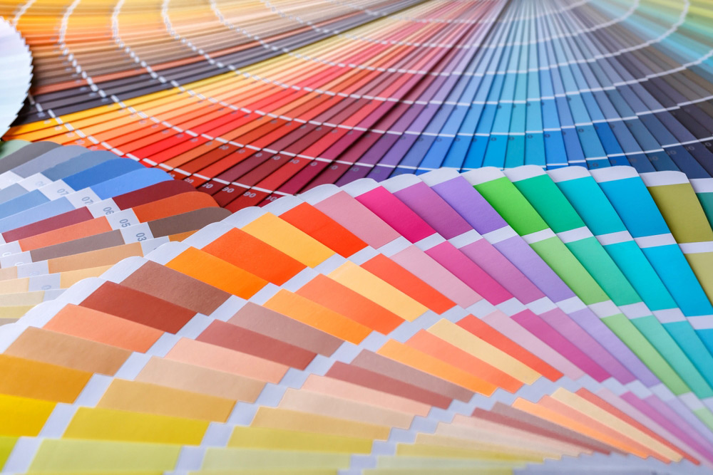
It’s understandable to play it safe, of course, particularly if you don’t have much faith in your sartorial instincts. But the interesting thing is, wearing an unexpected suit colour is actually one of the easiest ways to look like you know what you’re doing. And with the rise of gender-neutral dressing and fewer ‘dos and don’ts’ of menswear, it’s never been easier to break the mould and dip your toes into a new colour palette.
So, let’s dig into the daring and debonair, from crayola colours to offbeat neutrals, and explore those suit colours you’ve probably never heard of – and where on earth you can wear them.
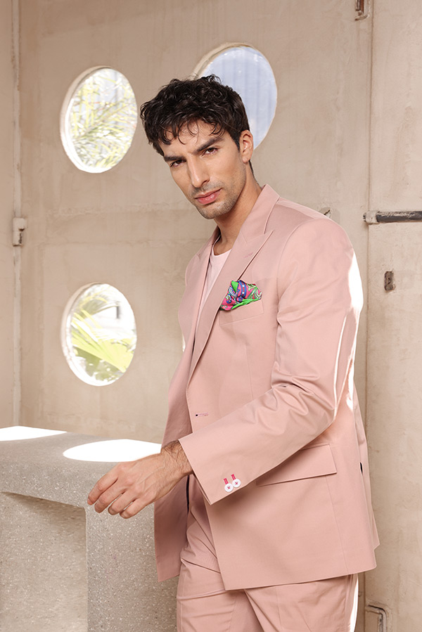
1. Dusty pink
Who says boys don’t wear pink? Not us, nor our forefathers. In the late 19th century, pink was actually the preferred colour for boys, while blue, which was perceived as less aggressive and associated with the Virgin Mary, was more suited to girls. It wasn’t until post-WWII that we flipped the associations.
Duty pink is a bolder alternative to blue, but it’s classic. Far enough away from Barbie and Bubblegum, it’s a muted and versatile shade that flatters most skin shades and suits most summer occasions, from rooftop parties to summer weddings and evening receptions. And yet, it still feels rebellious.
Where to wear it:
- A garden wedding
- A rooftop soiree
- A gallery launch
2. Ox-blood plum
This deep, rich tone sits somewhere between burgundy and aubergine and looks particularly good in textured fabrics, like brushed wools and velvets. It’s a dramatic hue that smacks of confidence and is particularly flattering in cooler months, thanks to its rich and warm tones.
It’s also more versatile than you might first assume. Unlike red, it doesn’t clash and can easily be paired with a crisp white shirt or soft grey poloneck. Perfect for when the occasion calls for elevated, but not over-the-top, attire.
Where to wear it:
- A cocktail party
- A networking event at a private members’ club
- A formal client dinner
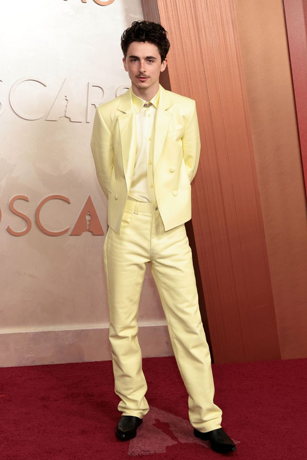
3. Butter yellow
This good-enough-to-eat hue is a favourite with celebs this year, for good reason. Sitting somewhere between beige and canary yellow, this versatile shade is a new neutral that works well with whites and ivory, camel and chocolate brown. Particularly attractive in linen or fine wool, butter yellow is ideal for transitional seasonal and summer looks.
It’s bold without being brash, and perfect for Golden Hour.
Where to wear it:
- A spring/summer wedding
- A relaxed or creative industry conference
- A daytime business event
4. Eggshell white
Pure white is bold and a little showy. For a little less John Travolta and Freddie Mercury, there’s eggshell white. This clean and fresh hue is technically off-white, but it’s far enough away from cream to flatter medium skin tones because it lacks the yellow undertones that usually wash you out. Pair it with tobacco brown for a warm and grounded contrast.
Where to wear it:
- An industry gala
- An upscale restaurant dinner
- A brand launch
5. Metallic silver
Ok, so you’ve heard of silver, but have you ever considered it for your suit? Strictly for those keen to push sartorial boundaries, this is a shade best worn in moderation for maximum impact. To tone down the flamboyance, opt for unusual shapes, like a boxy biker jacket.
This glimmering, shimmering hue is not for the faint-hearted and will almost certainly deliver a mic drop moment the second you enter the room. But if the occasion calls for it, we heartily encourage you to try it.
Where to wear it:
- A milestone birthday party
- An awards ceremony
- An after-party
6. Stone
If colour feels out of your comfort zone, but you’re still looking to experiment with new shades, stone could be just the ticket. A soft and sandy neutral, stone is an excellent alternative to white or cream that brings warmth and depth to any look. It pairs well with bolder tones like forest green and terracotta, but looks delightful with tonal shades too.
Where to wear it:
- A countryside wedding
- A summer work event
- A beachside dinner

7. Verdigris teal
Ideal for those with medium or olive skin tones, verdigris teal is a faded, slightly grey teal that is unexpected, but still refined. Less boardroom, more cosmopolitan cool, it’s an excellent alternative to classic navy or charcoal. Modern, yet timeless.
Where to wear it:
- International conferences
- Evening receptions
- Casual-formal hybrid dress codes
Top tips for mastering unconventional colour:
- Break up the suit. Unexpected colour is not for the faint of heart, so if you’re only looking to dip your toes in the pools of new shades, split it up by choosing a jacket in an unusual shade and anchor it with neutral trousers.
- Avoid wearing too many unconventional colours at one time. Stick to one statement colour and steer clear of too many patterns to avoid slipping into panto territory.
- If you’re hesitant, tone it down with a complementary dark, warm colour like burgundy, deep brown or charcoal.
Really, gents, nailing unconventional colour is all about dressing appropriately for the occasion and wearing it with confidence. Don’t overthink it – have fun and trust your instincts.
And, if you’re unsure or lack the confidence to venture into new territory, pop into one of our stores for a consultation.
See you soon, gents!